Ever wonder who comes up with those awesome, themed spaces at children’s hospitals and clinics? Andy Keller is one of them. Here he offers some tips and insights for making healthcare spaces a bit more child-friendly.

In your professional opinion, what are the top 3 things that make a hospital’s design child-friendly?
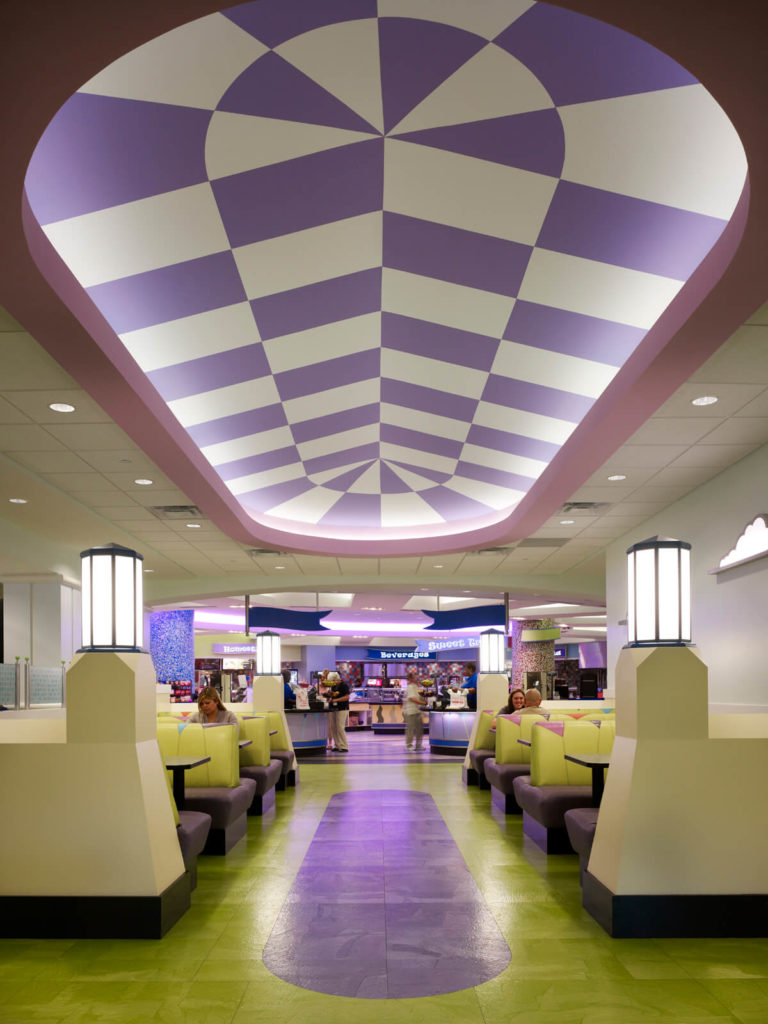
 1) Departments as neighborhoods: When you think of different departments or pods as distinct neighborhoods, and use that as your starting point, you develop different personalities that resonate with the staff, and they will start to absorb it and take pride in it. They will often start to wear uniforms that coordinate with the color palette or theme, get the kids working on projects that reflect the theme of the area, etc. It’s pride, simple pride, which can be developed with the staff. If staff members are proud of their area, it’s reassuring to families – it helps them feel they are part of a larger family.
2) Natural light! It’s a simple thing, but you’d be surprised how many factors conspire to make it sometimes difficult to achieve. When an institution has windowless waiting rooms, but doctor’s offices strung along exterior expanses of glass, you know you have an institutional mindset on your hands that you as a designer have some responsibility to try and change.
3) Design through a child’s eyes, and be prepared to defend it. This is not an easy thing for an adult to do, and it takes a lot of observation, but the goal is to create an environment that kids can take ownership of because it speaks to them. This can be tough to sell sometimes – what can appeal to a child might not appeal to a staff member, and which do you think makes the call to administration when they see something they don’t like? But when you see, for example, kids jumping down the hall on the colorful dots you designed to guide them down the corridor, you realize the effort was worth it. Also, sometimes success can be misconstrued as failure – for example, benches I specified that formed a curly-cue were so popular with kids that the vinyl kept wearing out, which made some want to get rid of them. Wrong conclusion! We compromised by specifying a tougher vinyl, and administration agreed to speed up the upholstery replacement cycle.
What are some of the things you take into consideration when designing/planning a children’s healthcare space?
Two things that I always start with are; what “look” would best reflect the culture of the specific institution, and how can I deploy the interior design to help with wayfinding? As to the former, it strikes me that too many institutions are designed to reflect the personality of the design firm, rather than the institution. I want children and families receiving superior care to associate that with a look and feel they experience at that specific institution. In essence, it’s branding 101 – as the institution grows, deploying “the look” will help families feel confident the care they are used to receiving from the main campus will be the same at outlying buildings or clinics. It’s up to the designer to make sure that it can be assembled from a kit of parts that is versatile enough to be effectively applied in areas big and small, and at different price points. As to wayfinding, most campus health centers today are of a size and accretion over time that wayfinding is one of their chief headaches, so much so that the very best signage design and placement simply isn’t enough. Institutions need an “all-hands-on-deck” mentality to approach wayfinding – signage, artwork, finishes, lighting – all gently nudging and pointing and suggesting how to get around staggeringly complex environments. This obviously isn’t specific to children’s healthcare facilities, but if some aspect of the wayfinding is at a child’s level, they can actually help the family navigate the facility. Any kid that can lead his family through the hospital is a happy kid, believe me.

Apart from large-scale renovations, what are some small things clinics or smaller hospitals can do to make their space more soothing, happy and positive for kids?
So many small clinics look like adult clinics where it has fallen to the staff to “child-ify” with posters and the like. There are the obvious moves – paint is cheap, and colors can be fun, rather than beige. Upholstered furniture: it can’t last forever. Next time it needs replacing or re-upholstering, pick something fun. Same with art. Nature scenes may seem like a good compromise, but they scream “generic”. Framed, matted artwork with a thoroughly child-friendly theme is inexpensive and makes a huge difference. Otherwise I would focus my efforts on the waiting room. Rows of seats are an efficient use of space, but about as charmless as can possibly be. Think about reconfiguring the seating into family size spaces. This is not as space-efficient but it might be possible to do without as many seats until flu season, at which time just bring out some stackable chairs. Also, don’t forget about siblings! They are often there waiting for their brother or sister. Games, interactives (both high and/or low tech), you name it – they need some distraction to keep them from drawing on the walls. Make sure waiting rooms have these things.